b
props.children and proptypes
Displaying the login form only when appropriate
Let's modify the application so that the login form is not displayed by default:
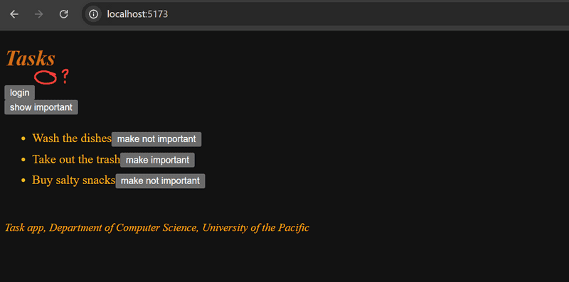
Rather, the login form appears when the user presses the login button.
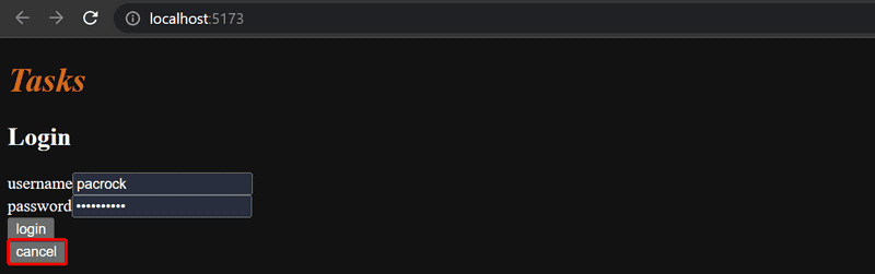
The user can then close the login form by clicking the cancel button.
Let's start by extracting the login form into a separate component and file:
const LoginForm = ({
   handleSubmit,
   handleUsernameChange,
   handlePasswordChange,
   username,
   password
  }) => {
  return (
    <div>
      <h2>Login</h2>
      <form onSubmit={handleSubmit}>
        <div>
          username
          <input
            value={username}
            onChange={handleUsernameChange}
          />
        </div>
        <div>
          password
          <input
            type="password"
            value={password}
            onChange={handlePasswordChange}
          />
      </div>
        <button type="submit">login</button>
      </form>
    </div>
  )
}

export default LoginForm
The state and all the functions related to it are defined outside of the component and are passed to the component as props.
Notice that the props are assigned to variables through destructuring, which means that instead of writing:
const LoginForm = (props) => {
  return (
    <div>
      <h2>Login</h2>
      <form onSubmit={props.handleSubmit}>        <div>
          username
          <input
            value={props.username}            onChange={props.handleChange}            name="username"
          />
        </div>
        // ...
        <button type="submit">login</button>
      </form>
    </div>
  )
}
where the properties are accessed through the props object like props.handleSubmit.
Instead, the properties are assigned directly to variables.
One fast way of implementing the functionality is to replace the loginForm function of the App component and introduce a new state variable:
const App = () => {
  const [loginVisible, setLoginVisible] = useState(false)
  // ...

  const loginForm = () => {
    const hideWhenVisible = { display: loginVisible ? 'none' : '' }
    const showWhenVisible = { display: loginVisible ? '' : 'none' }

    return (
      <div>
        <div style={hideWhenVisible}>
          <button onClick={() => setLoginVisible(true)}>login</button>
        </div>
        <div style={showWhenVisible}>
          <LoginForm
            username={username}
            password={password}
            handleUsernameChange={({ target }) => setUsername(target.value)}
            handlePasswordChange={({ target }) => setPassword(target.value)}
            handleSubmit={handleLogin}
          />
          <button onClick={() => setLoginVisible(false)}>cancel</button>
        </div>
      </div>
    )
  }

  // ...
}
You'll see that there will be a warning with LoginForm because we did not import it.
Use WebStorm's context actions (hopefully using the keyboard shortcut) to select the option to add the import statement.
The App component state now contains the boolean loginVisible, which defines if the login form should be shown to the user or not.
The value of loginVisible is toggled with two buttons.
Both buttons have their event handlers defined directly in the component:
<button onClick={() => setLoginVisible(true)}>login</button>

<button onClick={() => setLoginVisible(false)}>cancel</button>
The visibility of the component is defined by giving the component an inline style rule,
where the value of the display property is none if we do not want the component to be displayed:
const hideWhenVisible = { display: loginVisible ? 'none' : '' }
const showWhenVisible = { display: loginVisible ? '' : 'none' }

<div style={hideWhenVisible}>
  // button
</div>

<div style={showWhenVisible}>
  // button
</div>
We are once again using the ?: ternary operator.
If loginVisible is true, then the CSS rule of the component will be:
display: 'none';If loginVisible is false, then display will not receive any value related to the visibility of the component.
FYI:, Since we are moving components, I'm going to show you how to move the
Footercomponent outside of App.jsx. Select the entire function forFooter, and then in Webstorm, select Refactor->Move. Then in the To field, make sure to add the Components Folder in between src and Footer.jsx Make sure that only Footer is selected as the member to move, and click Refactor. Notice how Webstorm added the import and export portions and moved theFooterto its own file, components/Footer.jsx! Remember utilize the IDE to help you refactor when possible.
The components children, AKA props.children
The code related to managing the visibility of the login form could be considered to be its own logical entity,
and for this reason, it would be good to extract it from the App component into a separate component.
Our goal is to implement a new Togglable component that can be used in the following way:
<Togglable buttonLabel='login'>  <LoginForm
    username={username}
    password={password}
    handleUsernameChange={({ target }) => setUsername(target.value)}
    handlePasswordChange={({ target }) => setPassword(target.value)}
    handleSubmit={handleLogin}
  />
</Togglable>
The way that the component is used is slightly different from our previous components.
The component has both opening and closing tags that surround a LoginForm component.
In React terminology, *LoginForm is a child component of Togglable*.
We can add any React elements within Togglable's tags, like this for example:
<Togglable buttonLabel="reveal">
  <p>this line is hidden at the start</p>  <p>also this is hidden</p></Togglable>
The code for the Togglable component is shown below:
import { useState } from 'react'

const Togglable = (props) => {
  const [visible, setVisible] = useState(false)

  const hideWhenVisible = { display: visible ? 'none' : '' }
  const showWhenVisible = { display: visible ? '' : 'none' }

  const toggleVisibility = () => {
    setVisible(!visible)
  }

  return (
    <div>
      <div style={hideWhenVisible}>
        <button onClick={toggleVisibility}>{props.buttonLabel}</button>
      </div>
      <div style={showWhenVisible}>
        {props.children}        <button onClick={toggleVisibility}>cancel</button>
      </div>
    </div>
  )
}

export default Togglable
The new and interesting part of the code is props.children,
which is used for referencing the child components of the component.
The child components are the React elements that we define between the opening and closing tags of a component.
This time the children are rendered from within the parent component:
<div style={showWhenVisible}>
  {props.children}
  <button onClick={toggleVisibility}>cancel</button>
</div>
Unlike the normal props we've seen before, children are:
- automatically added by React
- always exist.
If a component is defined with an automatically closing /> tag, like this:
<Task
  key={task.id}
  task={task}
  toggleImportance={() => toggleImportanceOf(task.id)}
/>
Then props.children still exists, it's just an empty array.
The Togglable component is reusable and we can use it to add similar functionality to the form that creates tasks.
Before we do that, let's extract the form for creating tasks into a component:
const TaskForm = ({ onSubmit, handleChange, value}) => {
  return (
    <div>
      <h2>Create a new task</h2>

      <form onSubmit={onSubmit}>
        <input
          value={value}
          onChange={handleChange}
        />
        <button type="submit">save</button>
      </form>
    </div>
  )
}
Next, let's define the form component inside of a Togglable component in our taskForm function in App.jsx:
<Togglable buttonLabel="new task">
  <TaskForm
    onSubmit={addTask}
    value={newTask}
    handleChange={handleTaskChange}
  />
</Togglable>
You can find the code for our current application in its entirety in the part5-4 branch of this GitHub repository.
State of the forms
The state of the application is currently in the App component.
Is this where we should keep that state? Here's what the React documentation says:
Sometimes, you want the state of two components to always change together. *We recommend lifting that shared state up to their closest common ancestor, and then pass it down via props.*
If we think about the state in the forms, like a new task's contents, the App component does not need it for anything.
We could move the state in App into the appropriate subcomponents.
We'll start by modifying TaskForm.jsx to have the task creation state.
import { useState } from 'react'

const TaskForm = ({ createTask }) => {
  const [newTask, setNewTask] = useState('')

  const addTask = (event) => {
    event.preventDefault()
    createTask({
      content: newTask,
      important: false,    })

    setNewTask('')
  }

  return (
    <div>
      <h2>Create a new task</h2>

      <form onSubmit={addTask}>
        <input
          value={newTask}
          onChange={event => setNewTask(event.target.value)}
        />
        <button type="submit">save</button>
      </form>
    </div>
  )
}

export default TaskForm
FYI To make task creation work the same, we changed the application so that tasks are unimportant by default. The highlighted line above shows
importantnow having the valuefalse.
The newTask state variable and its change event handler have been moved from the App component to the component responsible for the task form.
TaskForm has one prop left, the createTask function, which the form calls when a new task is created.
The App component becomes simpler now that we have moved the newTask state and its event handler.
The addTask function for creating new tasks receives a new task as a parameter, and the function is the only prop we send to the form:
const App = () => {
  // ...
  const addTask = (taskObject) => {    taskService
      .create(taskObject)
      .then(returnedTask => {
        setTasks(tasks.concat(returnedTask))
      })
  }
  // ...
  const taskForm = () => (
    <Togglable buttonLabel="new task">
      <TaskForm createTask={addTask} />
    </Togglable>
  )

  // ...
}
We could do the same for the login form, but we'll leave that for an optional exercise.
The application code can be found on GitHub, branch part5-5.
References to components with ref
Our current implementation works; it does have one aspect that could be improved.
After a new task is created, it would make sense to hide the new task form.
Currently, the form stays visible.
There is a slight problem with hiding the form.
The visibility is controlled with the visible state variable inside of the Togglable component.
How can we access it outside of the component?
There are several ways to implement access to a component's functions from outside the component, but let's use the ref mechanism of React, which offers a reference to the component.
Let's make these changes to the App component:
import { useState, useEffect, useRef } from 'react'
const App = () => {
  // ...
  const taskFormRef = useRef()
  const taskForm = () => (
    <Togglable buttonLabel="new task" ref={taskFormRef}>      <TaskForm createTask={addTask} />
    </Togglable>
  )

  // ...
}
The useRef hook is used to create a taskFormRef ref,
that is assigned to the Togglable component containing the creation task form.
The taskFormRef variable acts as a reference to the component.
This hook ensures that the same reference (ref) is kept throughout re-renders of the component.
We also need to make the following changes to the Togglable component:
import { useState, useImperativeHandle } from 'react'
const Togglable = (props) => {  const [visible, setVisible] = useState(false)

  const hideWhenVisible = { display: visible ? 'none' : '' }
  const showWhenVisible = { display: visible ? '' : 'none' }

  const toggleVisibility = () => {
    setVisible(!visible)
  }

  useImperativeHandle(props.ref, () => {    return { toggleVisibility }  })
  return (
    <div>
      <div style={hideWhenVisible}>
        <button onClick={toggleVisibility}>{props.buttonLabel}</button>
      </div>
      <div style={showWhenVisible}>
        {props.children}
        <button onClick={toggleVisibility}>cancel</button>
      </div>
    </div>
  )
}

export default Togglable
The component uses the useImperativeHandle hook
to make its toggleVisibility function available outside of the component.
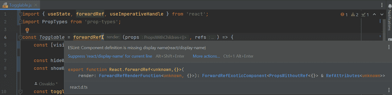
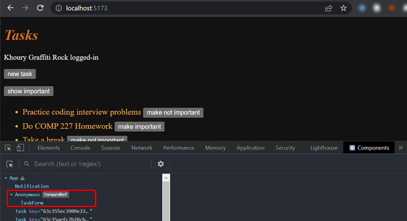
FYI: If you add this code as is and you already have eslint configured, you might see that Component
Togglablecauses a nasty-looking warning: Component definition is missing display name:You can read more about this ESlint rule in the ESlint react plugin's docs. In short, this rule is about helping you better debug your code. If you run the program, you might notice that react-devtools shows this component without a name:
A quick fix is to assign our component a
displayNameproperty:const Togglable = React.forwardRef((props, ref) => { // ... }) Togglable.displayName = 'Togglable'; export default Togglable
We can now hide the form by calling taskFormRef.current.toggleVisibility() after a new task has been created:
const App = () => {
  // ...
  const addTask = (taskObject) => {
    taskFormRef.current.toggleVisibility()    taskService
      .create(taskObject)
      .then(returnedTask => {
        setTasks(tasks.concat(returnedTask))
      })
  }
  // ...
}
To recap, the useImperativeHandle function is a React hook,
that is used for defining functions in a component, which can be invoked from outside of the component.
This trick works for changing the state of a component, but it looks a bit unpleasant. We could have accomplished the same functionality with slightly cleaner code using "old React" class-based components. We will take a look at these class components during part 7 of the course material. So far this is the only situation where using React hooks leads to code that is not cleaner than with class components.
There are also other use cases for refs than accessing React components.
You can find the code for our current application in its entirety in the part5-6 branch of this GitHub repository.
One point about components
When we define a component in React:
const Togglable = () => ...
  // ...
}
And use it like this:
<div>
  <Togglable buttonLabel="1" ref={togglable1}>
    first
  </Togglable>

  <Togglable buttonLabel="2" ref={togglable2}>
    second
  </Togglable>

  <Togglable buttonLabel="3" ref={togglable3}>
    third
  </Togglable>
</div>
We create three separate instances of the component that all have their separate state:
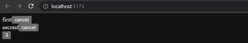
The ref attribute is used for assigning a reference to each of the components in the variables above: togglable1, togglable2 and togglable3.
Web developers pledge v5
We will once again update our web developer pledge but will also add a few more items:
I also pledge to:
- Ensure the frontend works if I suspect a bug in the backend
- Ensure the backend works if I suspect a bug in the frontend
Exercises 5.5-5.11
Hint:: If you're stuck on one of these exercises, why not revisit
populate?
5.5 Watchlist frontend, Step 5
Change the form for creating shows so that it is only displayed when appropriate.
Use functionality similar to what was shown earlier in this part of the course material.
If you wish to do so, you can use the Togglable component defined in part 5.
By default, the form is not visible
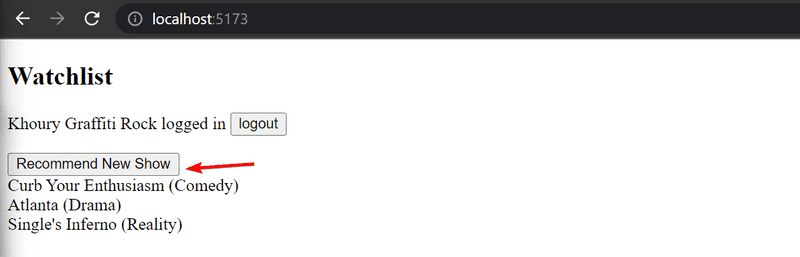
It expands when the button Recommend New Show is clicked
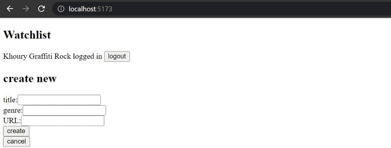
The form hides again after a now show is created or the cancel button is pressed.
5.6 Watchlist frontend, Step 6
Separate the form for recommending a new show into its own component (if you have not already done so), and move all the states required for recommending a new show to this component.
The component must work like the TaskForm component from this previously covered part.
5.7* Watchlist frontend, Step 7
Let's add a button to each show, which controls whether all of the details about the show are shown or not.
Full details of the show open when the button is clicked.
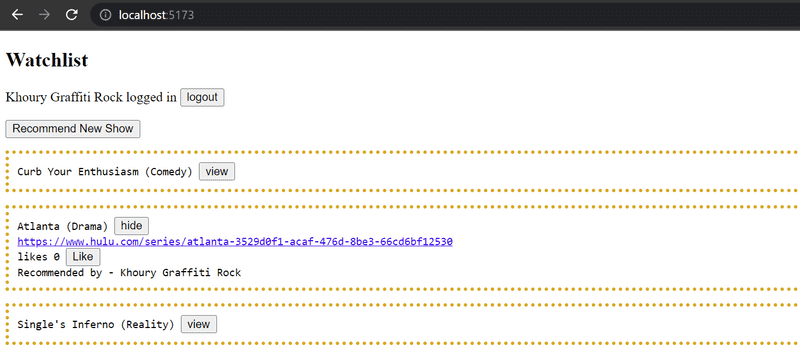
And the details are hidden when the button is clicked again.
At this point, the like button does not need to do anything.
The application shown in the picture has a bit of additional CSS to improve its appearance.
It is easy to add styles to the application as shown in part 2 using inline styles:
const Show = ({ show }) => {
  const showStyle = {
    padding: 10,
    border: 'dotted',
    borderWidth: 4,
    borderColor: 'goldenrod',
    marginTop: 15,
    fontFamily: 'monospace'
  }

  return (
    <div style={showStyle}>      <div>
        {show.title} ({show.genre})
      </div>
      // ...
  </div>
)}
Pertinent: even though the functionality implemented in this part is almost identical to the functionality provided by the
Togglablecomponent, the component can not be used directly to achieve the desired behavior. The easiest solution will be to add a state to the show that controls the displayed form of the show.
5.8: Watchlist frontend, Step 8
Implement the functionality for the like button. Likes are increased by making an HTTP PUT request to the unique address of the show in the backend.
Since the backend operation replaces the entire show, you will have to send all of its fields in the request body. If you wanted to add a like to the following show:
{
    _id: "5a43fde2cbd20b12a2c34e91",
  user: {
      _id: "5a43e6b6c37f3d065eaaa581",
    username: "powercat",
    name: "Tommy Tiger Jr"
  },
  likes: 0,
  genre: "Comedy",
  title: "Silicon Valley",
  url: "https://www.hbo.com/silicon-valley"
},
You would have to make an HTTP PUT request to the address /api/shows/5a43fde2cbd20b12a2c34e91 with the following request data:
{
    user: "5a43e6b6c37f3d065eaaa581",
  likes: 1,
  genre: "Comedy",
  title: "Silicon Valley",
  url: "https://www.hbo.com/silicon-valley"
}
The backend also has to be updated to handle the user reference.
One last warning: if you notice that you are using async/await and the then method in the same code,
it is almost certain that you are doing something wrong.
Stick to using one or the other, and never use both at the same time "just in case".
5.9: Watchlist frontend, Step 9
You may have noticed that something might be wrong with your app. When a new show is recommended in the app, the name of the user that recommended that show may not be shown in the details of the show:
It's only when we reload the browser, that the information of the person is displayed. This is not acceptable, find out where the problem is and make the necessary correction.
5.10: Watchlist frontend, Step 10
Modify the application to list the shows by the number of likes.
Sorting the shows can be done with the array's sort method.
5.11: Watchlist frontend, Step 11
Add a new button for deleting shows. Also, implement the logic for deleting shows in the frontend.
Your application could look something like this:
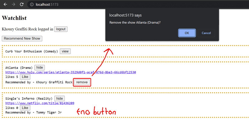
The confirmation dialog for deleting a recommended show is easy to implement with the window.confirm function.
Show the button for deleting a recommended show only if the show was added by the user.
ESlint
In part 3 we configured the ESlint code style tool to the backend. Let's take ESlint to use in the frontend as well.
Vite has installed ESlint to the project by default, so all that's left for us to do is define our desired configuration in the .eslint.config.js file.
Let's create a .eslint.config.js file with the following contents:
import js from '@eslint/js'
import globals from 'globals'
import reactHooks from 'eslint-plugin-react-hooks'
import reactRefresh from 'eslint-plugin-react-refresh'

export default [
  { ignores: ['dist', 'node_modules'] },
  {
    files: ['**/*.{js,jsx}'],
    languageOptions: {
      ecmaVersion: 2020,
      globals: globals.browser,
      parserOptions: {
        ecmaVersion: 'latest',
        ecmaFeatures: { jsx: true },
        sourceType: 'module'
      }
    },
    plugins: {
      'react-hooks': reactHooks,
      'react-refresh': reactRefresh
    },
    rules: {
      ...js.configs.recommended.rules,
      ...reactHooks.configs.recommended.rules,
      'no-unused-vars': ['error', { varsIgnorePattern: '^[A-Z_]' }],
      'react-refresh/only-export-components': [
        'warn',
        { allowConstantExport: true }
      ],      indent: ['error', 4],      'linebreak-style': ['error', 'unix'],      quotes: ['error', 'double'],      semi: ['error', 'never'],      eqeqeq: 'error',      'no-trailing-spaces': 'error',      'object-curly-spacing': ['error', 'always'],      'arrow-spacing': ['error', { before: true, after: true }],      'no-console': 'off',      'no-debugger': 'off'      //highlight-end    }  }]
Reminder: We may need to turn on our ESLint settings like we did in part 3 Make sure that you turn on
--eslint-fix-on-saveand configure the node interpreter for this new project again. If you are running into issues I would restart WebStorm. You can also introduce a space anywhere in a file and then save and it should then fix all the errors. We may update this with additional configurations, but for now, you can ask in discord if there are any issues.
As usual, you can perform the linting either from the command line with the command
npm run lintor using the editor's Eslint plugin.
Pertinent: Before you continue, make sure to fix all of the eslint errors, since our configuration is introducing new rules that we have not exactly followed up until this point in time.
You can find the code for our current application in its entirety in the part5-7 branch of this GitHub repository.